Protected Content
This content requires a password to be viewed.

Chat

Client

SiriusXM

Service(s)

UX/UI

Industry

Ecommerce

Year(s)

2022-2023

Programs used

Figma
Figma
Sketch
UserTesting
Confluence
Adobe Illustrator
Adobe Illustrator
Adobe Illustrator
Adobe Illustrator

A case study for design improvements for SiriusXM's help chat.

Digital painting of Yuri Kochiyama wearing a pin showing Malcolm X

Problems

The SiriusXM website chat was seen as more of a hindrance rather than a helpful tool. Problems included:

CTA dominated homepage

This was particularly an issue on mobile, where the CTA tended to be tapped by users on accident.

CTA dominated homepage

This was particularly an issue on mobile, where the CTA tended to be tapped by users on accident.

Unhelpful chatbot

Melody, the SiriusXM chatbot, tended to get confused or not understand commands typed in by users.

Unhelpful chatbot

Melody, the SiriusXM chatbot, tended to get confused or not understand commands typed in by users.

Users forced to chat for simple fixes

Users (and chat reps) were frustrated that they ended up spending time using chat on common help topics like refreshing a satellite radio or resetting their password.

Users forced to chat for simple fixes

Users (and chat reps) were frustrated that they ended up spending time using chat on common help topics like refreshing a satellite radio or resetting their password.

Research, ideation and planning

The first priority of the redesign was addressing major pain points, such reducing the chat CTA on the homepage while not eliminating that entry point entirely (as requested by the stakeholder).

I proceeded with competitive analysis by looking at the chat experiences of all retailers, ranging from online platforms like Hulu to retailers like Warby Parker. Design patterns that either supported the need to reduce chat's screen real estate or even relegating chat to specific flows (e.g. sales flows or self-support) began appearing frequently in my research.

Wireframe Test 1

Experimenting with tabbed CTAs and icons representing "chat" and "feedback."

Wireframe Test 1

Experimenting with tabbed CTAs and icons representing "chat" and "feedback."

Wireframe Test 2

Exposed stacked buttons. Users commented that liked the smaller footprint of the CTAs.

Wireframe Test 2

Exposed stacked buttons. Users commented that liked the smaller footprint of the CTAs.

Wireframe Test 3

Feedback removed due to analytics finding. Users remarked that they liked the muted button background color.

Wireframe Test 3

Feedback removed due to analytics finding. Users remarked that they liked the muted button background color.

Challenges and opportunities

The chat platform's representative (as SiriusXM's chat was hosted on a third party vendor) acted as a valuable resource for their program's capabilities.

For example, while I initially had ideas of integrating chat with our help center, hopefully funneling users to utilize the help center's resources before contacting customer support, the representative told me that they couldn't implement that type of functionality now, but that was on their roadmap for a future release.

With that limitation (and others) in mind, I kept improvements to few main fixes:

Reducing CTA size

Also applying some attention grabbing animation when needed.

Reducing CTA size

Also applying some attention grabbing animation when needed.

Reduce reliance on bot

Experience that relies less on typing commands to a limited AI while still maintaining traditional chat layout if/when bot changes to live chat.

Reduce reliance on bot

Experience that relies less on typing commands to a limited AI while still maintaining traditional chat layout if/when bot changes to live chat.

Clean up visual design

Create a cleaner, more modernized chat that uses simple yet pleasant transitional animation (based on user feedback).

Clean up visual design

Create a cleaner, more modernized chat that uses simple yet pleasant transitional animation (based on user feedback).

Selected design changes

Selected design changes

Scroll to see notations.

Full chat CTA on load and minimizes after a few seconds. Ellipses in chat bubble jump after no activity on page to get user attention.
If the user closes the chat window and a message is waiting, a lavender dot appears and pulses above the icon. Lavender tested well with users, as red was seen as too negative.
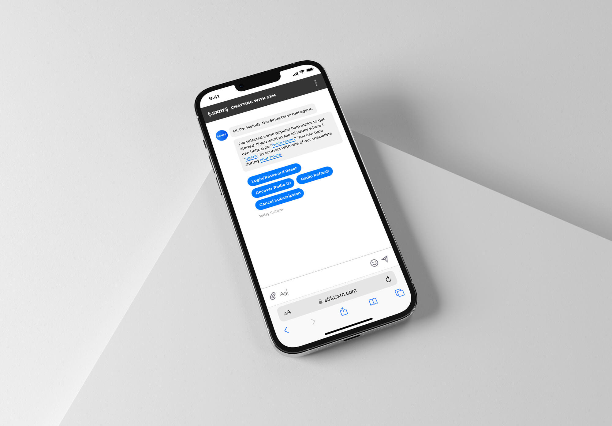
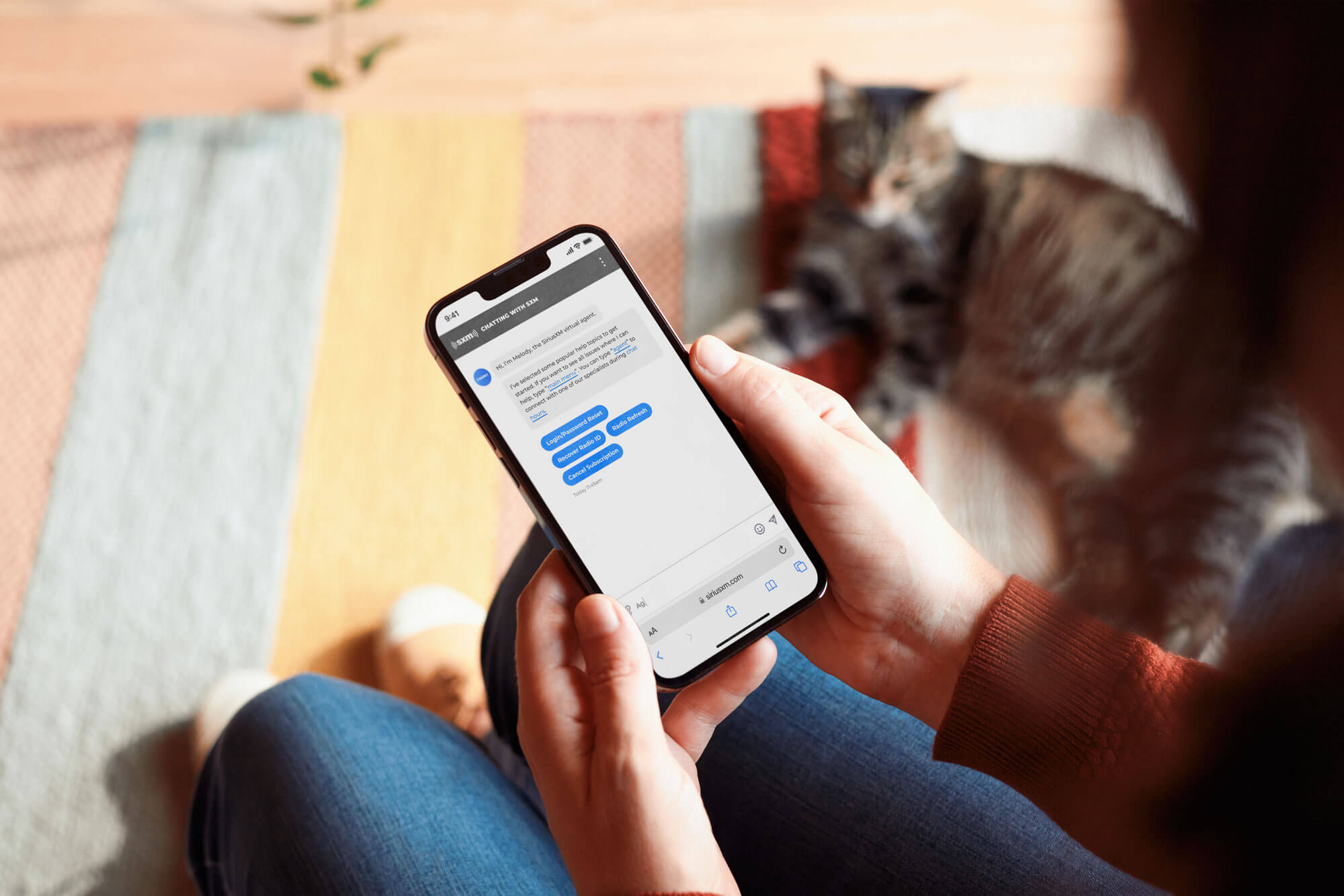
Upon tapping the CTA, the user is eased into the chat experience, first quickly greeted by Melody, the SiriusXM chatbot and provided popular commands via clear CTAs.

Result

Only a few changes for the help chat were implemented due to a sudden shift in that department's leadership and the project getting backlogged. However, a welcome improvement was the reduction in size for the chat's button, which been reduced to a small 56px by 56px CTA. Complaints to customer service about chat interfering with user experience reduced significantly according to the chat team.

Digital painting of Yuri Kochiyama wearing a pin showing Malcolm X